
Frequency Polygon & Advantages of frequency polygon over the Histogram
What is a Frequency Polygon?
The Frequency Polygon, which is closely related to the histogram, is one of the most widely used graphs for charting a frequency distribution. When comparing two or more frequency distributions, it is especially useful.
A frequency polygon is a graph of a frequency distribution with more than four sides. The frequency polygon is made up of line segments that connect the points where the class marks and class frequencies intersect. The two endpoints help to complete the diagram by allowing the frequencies to drop off to zero on both ends.
A frequency polygon is a graph drawn on the x and y axes. The dataset’s values are represented on the x-axis, while the frequency of each distinct class is represented on the y-axis.
The frequency polygon is more realistic than the histogram because the number of observations increases or decreases more smoothly across the different classes.
How to construct a frequency polygon:
The frequency polygon can be formed by following the steps below:
- First set the lower and upper limits of each class and arrange them in one column to find the classes in the dataset.
- Then calculate the class’s midpoints. The formula below can be used to find the midpoints:
Midpoint = (Lower limit of class+ Upper limit of class) / 2
These calculated midpoints must be placed in a distinct column.
- Then calculate the frequencies for each class and place them in a distinct column.
- Then we must also include the first and last classes with zero frequencies to guarantee that our graph is definitely a polygon (i.e., the graph is closed-shape).
In general, there are two methods of creating a frequency polygon.
(I) First Method:
We can make a histogram of the data and then connect the mid-points of the upper horizontal sides of each rectangle with the adjacent ones using a straight line. The resulting figure (diagram) shall be a frequency polygon.
To make the area under frequency polygons equal to the area under Histogram, both ends of the polygon should be extended to the baseline.
(II) Second Method:
Another way to make a frequency polygon is to take the midpoints of the various class intervals, plot the frequency associated with each point, and connect all of these points with straight lines.
Both methods would provide the same diagram.
Advantages of frequency polygon over the histogram:
In comparison to the histogram, the frequency polygon offers more advantages.
- The main advantage of a frequency polygon over a histogram is that you can draw two or more frequency polygons of several distributions on the same axis, which makes it possible to compare. But a histogram cannot be utilised in the same way, we construct histograms on separate graphs to compare them. Hence, frequency polygons are preferred for providing a graphic comparison of frequency distributions due to this limitation.
- The frequency polygon is relatively simpler than the histogram.
- It draws a more clear outline of the data pattern.
- As we increase the number of classes and observations, the polygon gets increasingly smooth and curve-like.
Example: Draw a Frequency Polygon from the following data:
| 16 | 21 | 9 | 23 | 19 | 23 | 20 | 23 | 18 | 9 |
| 19 | 29 | 20 | 13 | 10 | 23 | 20 | 15 | 11 | 19 |
Solution: To sketch a Frequency Polygon, first divide the data into classes, where each class has the same width.
Step 1: First, arrange the original data set in ascending order as follows:
| 9 | 9 | 10 | 11 | 13 | 15 | 16 | 18 | 19 | 19 |
| 19 | 20 | 20 | 20 | 21 | 23 | 23 | 23 | 23 | 29 |
Step 2: Divide the data into classes. Here, the smallest and largest numbers in this data are 9 and 29, respectively. If we choose 6 classes, then the class width will be,
Class width ≈ (Largest data value – Smallest data value)/( Number of classes) = (29 – 9)/6 = 3.33 ≈ 4.
We choose 6 classes of width 4 starting at 6, and add successively the class width of 4 to get other class boundaries.
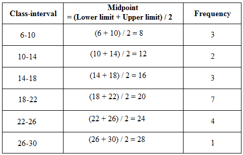
Step 3: The numbers are grouped into classes 6-10, 10-14, and so on. Then calculate the class’s midpoints using the formula: Midpoint = (Lower limit of class+ Upper limit of class) / 2; and place these midpoints in a distinct column, as shown in the following frequency distribution table:
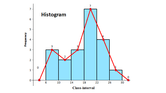
Step 4: Then, sketch the histogram using these above frequencies, and then connect the mid-points of the upper horizontal sides of each rectangle with the adjacent ones using a straight line. Include the first and last classes with 0 frequencies to guarantee that the graph is definitely a polygon.
The frequency polygon with histogram for the original data is shown in the following figure:
Step 5: The frequency polygon for the original data is shown in the following figure:
(Source – Various books from the college library)
Copyrighted Material © 2019 - 2024 Prinsli.com - All rights reserved
All content on this website is copyrighted. It is prohibited to copy, publish or distribute the content and images of this website through any website, book, newspaper, software, videos, YouTube Channel or any other medium without written permission. You are not authorized to alter, obscure or remove any proprietary information, copyright or logo from this Website in any way. If any of these rules are violated, it will be strongly protested and legal action will be taken.

Be the first to comment