
What is a Smoothed Frequency Curve in Statistics?
A smoothed frequency curve is a smoothed curve, which is a graphic representation of the frequency distribution. To draw a smoothed frequency curve for the frequency distribution, join the various points of frequency polygon by a freehand smoothed curve. For drawing smoothed frequency curve it is necessary to first draw the polygon and then smoothen it.
To draw a smoothed frequency curve for the frequency distribution, the histogram can also be used. For this, we draw a freehand smoothed curve through the midpoints of the upper sides of the rectangles of the histogram.
To draw a smoothed frequency curve without using a histogram, plot the class’s frequency against its midpoints of class intervals and connect the points by a freehand smoothed curve.
It is important to keep in mind that the curve must be drawn freehand in such a way that the area covered by the curve is approximately equal to the area covered by the frequency polygon. Also, all sudden and sharp turns should be ignored, and the curve should appear as regular as possible.
A frequency curve has a total area of one. It’s a histogram’s or frequency polygon’s limiting form.
The objective of drawing a Smoothed Frequency Curve:
We know that a frequency curve is a smooth curve, and it corresponds to the limiting case of a histogram obtained for a continuous frequency distribution when the number of data points increases to a very large number.
The main objective of creating a smoothed frequency curve is to remove all incidental fluctuations in the original data, as much as possible. However, after smoothing, the top of the curve will overtop the highest point of the polygon, especially when the size of the class interval is large.
Points to consider while smoothing a frequency graph:
The degree of smoothing would be dependent on the data’s type and nature. It is important to first draw the frequency polygon and then smooth it in order to draw a smoothed frequency curve.
To smooth a frequency graph, keep the following points in mind:
- Only sample-based frequency distributions should be smoothed.
- Smoothing should only be done on continuous series.
- All sudden and sharp turns should be ignored.
- The overall area under the curve and the area under the histogram or frequency polygon should be equal.
- The frequency curve should appear as regular as possible.
Characteristics of the Frequency Curve:
The characteristics of a frequency curve are as follows:
- A frequency curve is created by smoothly connecting the graph’s consecutive points using a specific pattern.
- A frequency curve may be created by combining the midpoints of the rectangles in the histogram.
- The only difference between a frequency polygon and a frequency curve is that a frequency curve is drawn freehand and a frequency polygon is made using scale.
How to construct a Frequency Curve:
The frequency curve is a smooth curve that can be created by joining the histogram’s midpoints. To draw the frequency curve, we will use the following process:
- First set the lower and upper limits of each class and arrange them in one column to find the classes in the dataset.
- Then calculate the class’s midpoints. The formula below can be used to find the midpoints:
Midpoint = (Lower limit of class+ Upper limit of class) / 2
These calculated midpoints must be placed in a distinct column.
- Then calculate the frequencies for each class and place them in a distinct column.
- Then we must also include the first and last classes with zero frequencies to guarantee that our graph is definitely a closed-shape graph.
In general, there are two methods of creating a frequency curve.
(I) First Method:
We can make a histogram of the data and then connect the mid-points of the upper horizontal sides of each rectangle with the adjacent ones using smooth freehand curves. The resulting figure (diagram) shall be a frequency curve. In detail, the process to draw the frequency curve are as follows:
- On the x-axis, plot the dataset’s values, and on the y-axis, plot the frequency of each distinct class.
- Then, using the data values, draw a histogram.
- Now, on the histogram, mark the midpoints of the upper horizontal sides of each rectangle.
- Then, join the midpoints of each rectangle with the adjacent ones using straight lines. The graph formed by joining these straight lines is referred to as a frequency polygon. To make the area under frequency polygons equal to the area under the histogram, both ends of the polygon should be extended to the baseline.
- Finally, join the midpoints using smooth freehand curves. The graph formed by joining by using the curve is referred to as a frequency curve.
(II) Second Method:
Another way to make a frequency curve is to take the midpoints of the various class intervals, plot the frequency associated with each point, and connect all of these midpoints using smooth freehand curves. The graph formed by joining by using the curve is referred to as a frequency curve.
Both methods would provide the same diagram.
Example:
Draw a Frequency Polygon from the following data:
| 16 | 21 | 9 | 23 | 19 | 23 | 20 | 23 | 18 | 9 |
| 19 | 29 | 20 | 13 | 10 | 23 | 20 | 15 | 11 | 19 |
Solution:
To sketch a Frequency curve, first divide the data into classes, where each class has the same width.
Step 1: First, arrange the original data set in ascending order as follows:
| 9 | 9 | 10 | 11 | 13 | 15 | 16 | 18 | 19 | 19 |
| 19 | 20 | 20 | 20 | 21 | 23 | 23 | 23 | 23 | 29 |
Step 2: Divide the data into classes. Here, the smallest and largest numbers in this data are 9 and 29, respectively. If we choose 6 classes, then the class width will be,
Class width ≈ (Largest data value – Smallest data value)/( Number of classes) = (29 – 9)/6 = 3.33 ≈ 4.
We choose 6 classes of width 4 starting at 6, and add successively the class width of 4 to get other class boundaries.
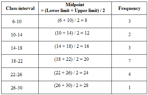
Step 3: The numbers are grouped into classes 6-10, 10-14, and so on. Then calculate the class’s midpoints using the formula: Midpoint = (Lower limit of class+ Upper limit of class) / 2; and place these midpoints in a distinct column, as shown in the following frequency distribution table:
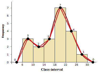
Step 4: Then, sketch the histogram using these above frequencies, and then connect the mid-points of the upper horizontal sides of each rectangle with the adjacent ones using a straight line, and then connect them using smooth freehand curves. Include the first and last classes with 0 frequencies to guarantee that the graph is definitely a polygon.
The frequency curve with frequency polygon and histogram for the original data is shown in the following figure:
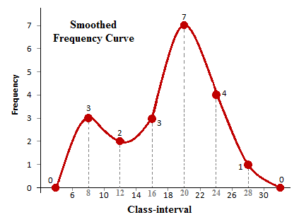
Step 5: Finally, the frequency curve for the original data is shown in the following figure:
(Source – Various books from the college library)
Copyrighted Material © 2019 - 2024 Prinsli.com - All rights reserved
All content on this website is copyrighted. It is prohibited to copy, publish or distribute the content and images of this website through any website, book, newspaper, software, videos, YouTube Channel or any other medium without written permission. You are not authorized to alter, obscure or remove any proprietary information, copyright or logo from this Website in any way. If any of these rules are violated, it will be strongly protested and legal action will be taken.

Be the first to comment