
Different Types of Frequency Distribution Graphs:
The guiding principles that apply to the graphical representation of frequency distributions are exactly the same as those that apply to the graphic and diagrammatic representation of other types of data.
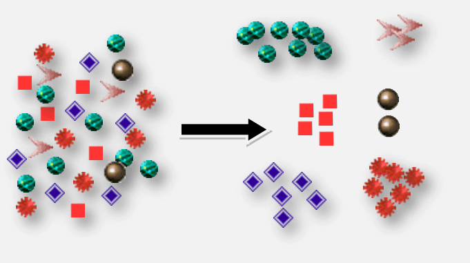
The data in a frequency distribution can be displayed as graphs, which highlight important characteristics and relationships that would be difficult to detect from a simple inspection of the frequency tables.
The following are the most widely used graphs for charting a frequency distribution for a general understanding of the details of the data:
- Line Frequency Diagram
- Histogram
- Frequency polygon
- Smoothed frequency curves
- Ogives or cumulative frequency curves.
[Graphs are charts that contain points, lines, and curves. Graph sheets are used to create charts. Suitable scaling for both the x and y axes must be chosen, so that the complete data set may be displayed on the graph sheet.]
Different Types of Frequency Distribution Graphs in Hindi
आवृत्ति वितरण के रेखाचित्र (ग्राफ़) के विभिन्न प्रकार:
आवृत्ति वितरण के ग्राफिकल प्रतिनिधित्व पर लागू होने वाले मार्गदर्शक सिद्धांत बिल्कुल वही हैं जो अन्य प्रकार के डेटा के ग्राफिक और आरेखीय प्रतिनिधित्व पर लागू होते हैं।
आवृत्ति वितरण (frequency distribution) से सम्बंधित सूचना (Data) को एक रेखाचित्र (graphs) द्वारा भी दिखाया जा सकता है जो उन महत्वपूर्ण विशेषताओं और सम्बन्धों को बताता है जिसे आवृत्ति तालिका (frequency tables) के निदर्शन परीक्षण (sample examination) से पता लगाना मुश्किल होगा।
डेटा के विवरण की सामान्य समझ के लिए, साधारण रूप से आवृत्ति वितरण को रेखाचित्र से दिखाने के लिए, सबसे अधिक उपयोग किए जाने वाले रेखाचित्र (ग्राफ) निम्नलिखित हैं:
- रेखा आवृत्ति चित्र (Line Frequency Diagram)
- आवृत्ति आयत चित्र (Histogram)
- आवृत्ति बहुभुज (Frequency Polygon)
- सरल आवृत्ति वक्र (Smoothed Frequency Curve)
- ओजाइव वक्र या संचयी आवृत्ति वक्र (Ogive or Cumulative frequency curves)
[ग्राफ़ ऐसे चार्ट होते हैं जिनमें बिंदु, रेखाएं और वक्र होते हैं। चार्ट बनाने के लिए ग्राफ़ शीट का उपयोग किया जाता है। x और y दोनों अक्षों के लिए उपयुक्त स्केलिंग का चयन किया जाना चाहिए, ताकि पूरा डेटा सेट ग्राफ़ शीट पर प्रदर्शित हो सके।]
(Source – Various books from the college library)
Copyrighted Material © 2019 - 2024 Prinsli.com - All rights reserved
All content on this website is copyrighted. It is prohibited to copy, publish or distribute the content and images of this website through any website, book, newspaper, software, videos, YouTube Channel or any other medium without written permission. You are not authorized to alter, obscure or remove any proprietary information, copyright or logo from this Website in any way. If any of these rules are violated, it will be strongly protested and legal action will be taken.
Be the first to comment